Accessibility & Multi-Screen Design
Responsive Web Design

Eric Eggert, outline

Accessibility &
Multi-Screen Design Responsive Web Design

Disclaimer
This course is not a W3C course.
Views expressed are my own.

Dies ist kein W3C-Kurs.
Alle Ansichten sind meine Eigenen.

Responsive Web Design almost non-technical

RWD ist the answer for…

A lot of different devices

Resolutions

#FFLY

Future friendly helmet

Embrace the web medium

The control which designers know in the print medium, and often desire in the web medium, is simply […] the limitation of the printed page. We should embrace the fact that the web doesn’t have the same constraints, and design for this flexibility.

John Allsopp

Mobile vs. Desktop

Mobile vs. Desktop

Mobile web usage

Facets of the same experience

Rather than tailoring disconnected designs to each of an ever-increasing number of web devices, we can treat them as facets of the same experience. We can design for an optimal viewing experience, but embed standards-based technologies into our designs to make them not only more flexible, but more adaptive to the media that renders them.

Ethan Marcotte

Three Basic Concepts

Examples

Are you a real web designer?

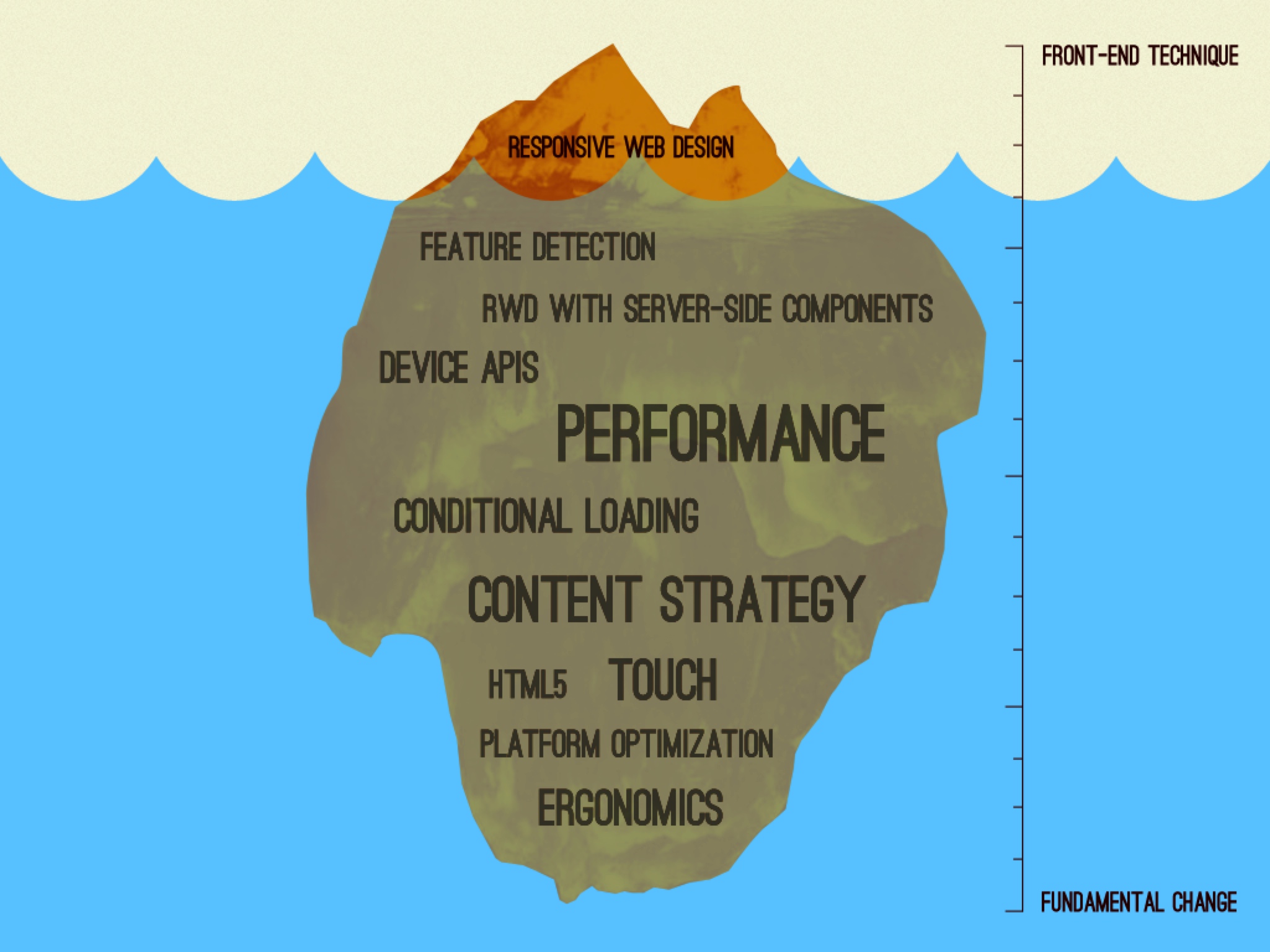
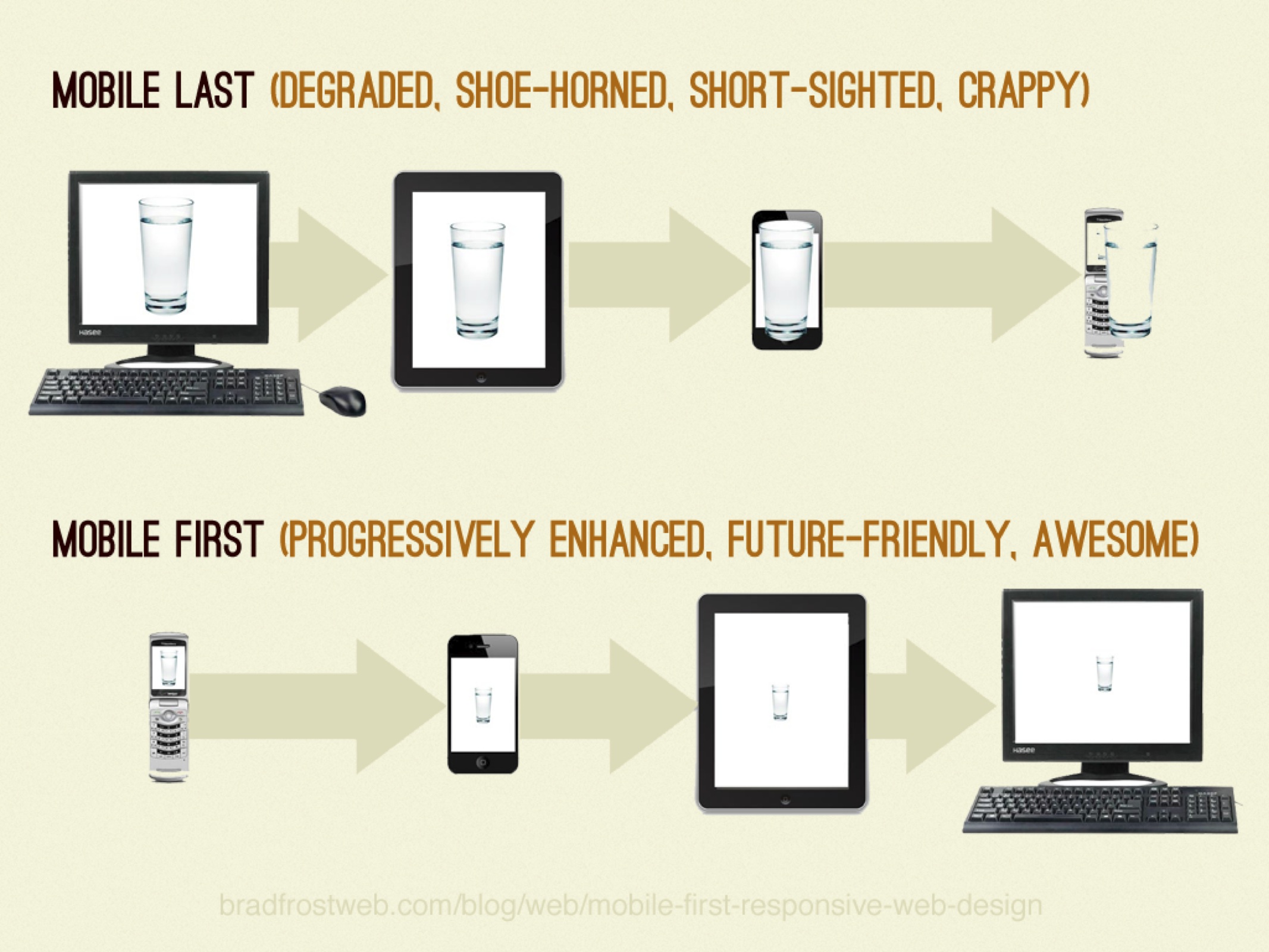
Anything that’s fixed and unresponsive isn’t web design anymore, it’s something else. If you don’t embrace the inherent fluidity of the web, you’re not a web designer, you’re something else. Web design is responsive design. Responsive Web Design is web design, done right.

Andrew Clarke

Tip of the iceberg

Tip of the iceberg

More base principles

The web will be everywhere:

Ubiquity

The One Web w/ Thematic consistency
(Same URL, same content)

Ubiquity

Give the user what they want, when they want it.

Squishiness

71%of mobile users expect that websites load at least as fast as on the desktop

Only 5 secondsdo 74% of mobile users wait for a website to load. After that they walk away.

Only 5 seconds

1MBAverage weight of web page

86%of responsive websites weight as much in their mobile view as they do in the desktop view.

We have a
Website Obesity Crisis

Performance is
Invisible

Performance is
Design

RWD One size fits all

Progressive Enhancement

Modernizr

Modernizr Options

Mobile first vs. Mobile last

Embrace the unforseeable

2007 2010 2013 2015? 2019

Summary

  1. We don’t know what the next trend is.

fin.